top of page


Digipak step by step editing
The first thing I did when opening my Photoshop is downloading a digipak template from google, saving it in the programme 'Paint' before opening it into Photoshop. I then decided to choose my colour from a colour chart on the right hand side. I wanted a neutral, brown like colour because this is a colour that I heavily saw involved with the genre indie folk in my research. Once I had selected my colour I selected the shape tool on the left hand side and right clicked which brought up a group of shapes. I then pressed CTRL + T which allowed my to resize the square to fit the dimensions on the template. I then filled this shape with the colour I had previously selected. I then duplicated the layer on the right hand side which gave me to of the same equal shapes. Once I had the front and back cover, I had to decide on the photo I wanted on the front cover. From my research I noticed that the majority of indie folk bands have a picture of themselves on the front, to make it more personal to the audience. To add the retro style on the picture of the band to show that it is from the indie folk, I reduced the opacity to give it an old fashioned look.

Once I had the front cover, I needed to add something to the back cover. I wanted to have a picture of the lead singer on the back to once again conform to the conventions of having numerous pictures of the band on an indie folk digipak. Therefore, I opened a picture of Lucas in a separate tab, which allowed me to cut around him using the quick-select tool and then remove him from the previous picture and drag him onto the digipak template. I did this by pressing CTRL and clicking the left button on the mouse.

From my research into digipaks, I found out that the song list usually goes onto the back of the digipak along with the barcode and copyright notice. Therefore, I started with the barcode which I got from google. I then opened it in Photoshop and because I had saved a transparent picture, the only thing I had to do was resize the picture by pressing CTRL +T. I then had to click the text tool button on the left hand side which then allowed me to write the text I wanted. It also allowed me to write a title to show that these were song titles. To make this title clear I then decided to add a line beneath the title. I did this by right clicking on the shape tool which brought up some different shapes. I then clicked the line tool and drew my line under the title. I then went onto 'The Lumineers' website where I found a copyright notice. I thought this would be ideal to put on the bottom of my digipak, so I click the text tool again and pasted the notice into it.
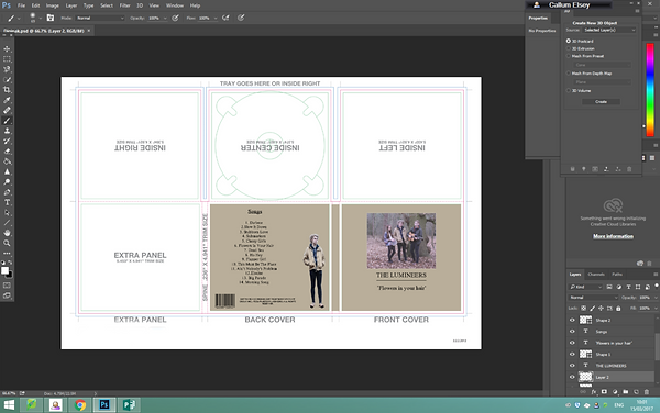
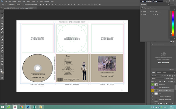
I then had to add a disc into my template. I could of done this by drawing my own circle by using the shape tool, however I thought it would look better by getting a disc template from google, then importing it into my Photoshop document. Once again, I had searched for a template with a transparent background, so the only thing I had to do was resize it and move it onto my digipak template. However, from my research into indie digipaks, I noticed that the disc usually looks very similar to the front cover of the digipak. Therefore, I selected the pipet tool and clicked my front cover. This gave me the specific colour I used on my front cover and allowed my to fill the disc the same colour.


To continue making my disc look similar to my front cover, I had to add the same title to my disc, which meant the same size and font size. Therefore, I duplicated the three layers on the righthand side this gave the exact same text allowing me to move the duplicated layers onto the disc.
Once I had the extra panel finished as well as the front and back cover, I knew I was able to remove the dimensions to make it look more professional. Therefore, I selected the shape tool and clicked the rectangle shape. I then resized the rectangle by pressing CTRL + T and filled it white my clicking the colour chart and the top. However, this then covered everything I had previously done before. This meant that I had to drag it down all the layers and put it second from bottom, so that everything showed apart from the dimension template. I didn't delete the template because if I was unsure on the dimensions I could click the eye button next to each layer and remove that layer for a short while until I clicked the eye again to bring the image back.

On the inside covers of the digipak, I wanted to have one picture that went over all three sections. I also wanted a picture that linked to my music video and because I already had one of my locations in the digipak, I decided to include the other location. I decided to use a picture of the beach huts that feature in in my music video. I opened the picture up and then resized it across the three sections. However, just like the picture on the front cover, I wanted it to have an old fashioned style look to make have more of an indie-folk edge. Therefore, I reduced the opacity. The only problem I had when I did this was the picture had little bits of white showing through the picture, so to keep the digipak consistent I created a rectangle the same size as the beach huts picture. I then moved it down the layers and then reduced the opacity of the picture. This gave it a indie-folk look as well as a warm feeling which is the emotion that was felt in narrative of the music video.

When I researched into digipaks, such as bands like Seafret, I noticed that they had two discs. One usually contained the songs advertised on the digipak and the other included a bonus track or interviews. Therefore, I duplicated the text from the disc as well as the disc and moved it to the middle section of the beach huts. I had to put the disc, text and beach huts picture upside down because if not as I folded the digipak it would of been upside down. Therefore, if I made it upside down in Photoshop it would the correct way round when I folded it.

bottom of page